|
March
14, 2006
College Hockey's Best (and Worst) Sweaters Revealed
By
Jayson Hron
When it comes
to gauging sartorial splendor, INCH decided scientific measurement
was essential. As a result, we put our education to good use
conceiving the Best Sweater Rating Index (BSRI), a highly
scientific effort that rendered our initial ranking of Division
I sweaters.
Each team’s best sweater was rated in
four categories – colors, continuity, originality, and
overall visual appeal – receiving scores ranging from
1 (hideously awful) to 5 (perfect). Those four scores were
then added to produce an index, the BSRI.
Disclaimer: This is highly subjective
stuff. With that said, three unbreakable rules dominate the
entirety of hockey sweaterdom.
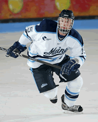 |
| What's better than Maine's white
sweaters? According to the BSRI, nothing. |
1. Diagonal lines are indescribably
odious. They should be banned immediately as the
dated trend that never should have been. Any team engaging
in the use of diagonal lines is spitting in the face of tasteful
design, tradition and all that is good about hockey sweaters.
Such transgressions earned a harsh penalty in the BSRI.
2. The second unbreakable rule
relates to use of the color purple. Don’t.
3. Sweaters are like national flags.
The symbolism means something. There’s a reason the
United States doesn’t have a new-look American flag
every year. It’s the same reason sweaters shouldn’t
change annually. That led us to the continuity metric. Teams
that maintain similar styles, or teams that pay tribute to
their history with throwback sweaters, garner higher continuity
ratings.
Also, as a final footnote, Division I-independent
RIT was not rated since it does not yet belong to a conference.
The Conferences
WCHA teams might play the best, but they don’t
look the best. With an average conference rating of 17.2 out
of a possible 20.0, the WCHA ranked third among the six Division
I conferences. The ECAC Hockey League (17.4) claimed top honors,
narrowly eclipsing the second-place CCHA (17.3). Hockey East
(17.1) ranked fourth. The CHA (16.3), thanks to Bemidji State,
outdistanced Atlantic Hockey (16.2) to avoid the cellar.
The Best of the Best
Our initial BSRI rendered Maine’s white
sweater as the best of 2006 with a score of 18.7. An excellent
color combination combined with simple, clean design and a
timeless look swayed our voters. It’s the quintessential
college hockey jersey, complete with easy-to-read numbers
and names for the press box StatCrew jockeys. Michigan’s
whites, Princeton’s blacks, Boston University’s
alternate red and Providence’s white with the classic
Friar logo rounded out the top five by tying for second. Each
received a BSRI mark of 18.4.
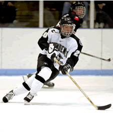
The Worst of the Worst
 |
| Diagonals, a strange
logo: all that's missing from Ferris State's sweaters
is a healthy dose of purple. |
As previously noted, we’re not particularly
keen on sweater changes but, if there was ever a sweater that
begged for change, it was last year’s Ferris State abominations.
The Bulldogs already had one major strike against them thanks
to their heinous logo, a grossly cartoonish and sketchy Bulldog,
yet they decided to leap completely into yuckville with diagonal
lines everywhere. It was as if they hoped to ugly opponents
into submission. We are happy to report that Ferris State
made some improvements this year, narrowly avoiding BSRI purgatory.
That dubious distinction went instead to Merrimack,
which earned a 14.1 rating with its Nashville Predators knockoffs.
We don’t mean to pile on, but if you’re going
to copy an NHL sweater, at least copy a good one. Poor marks
for originality and overall appeal sunk Merrimack in the BSRI.
Rounding out the bottom five was Niagara (14.6),
a purple team with a REALLY BIG “N” that copied
Los Angeles’s sweaters, Canisius (14.8), with a strange
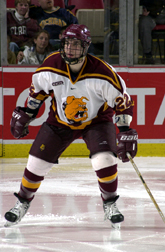
pastel yellow color, Minnesota State (14.9), which wears purple
and keeps the sweater manufacturers busy like no one else,
and Robert Morris (14.9).
Disclaimer: Please understand, rating
in the bottom five doesn’t necessarily mean your sweater
looks that bad. It could just signify that you have a history
of breaking rules or being unoriginal. Or it might mean your
sweater is U-G-L-Y, ugly.
The Notables:
While every team was ranked, some didn’t
merit much comment. These did:
WCHA:
Denver (16.0) – The Pioneers’ logo
is not good. A bird is not a pioneer. Also, the word “Denver”
needs to be higher on the chest. We like the numbers on the
front, though. That’s a classic design decision that
merits high marks in the BSRI.
Minnesota (17.7) – Few schools have more
tradition and pride than Minnesota, plus it boasts one of
the cleanest, most powerful, iconic logos in all of athletics.
So how do the Golden Gophers end up with some of the worst
sweaters in college hockey this season? Diagonal lines and
a muddled blob on their shoulders. They aren’t the worst
sweaters in Minnesota history, but they’re close. Thankfully,
BSRI rated the yellow alternates, which aren’t too bad.
Minnesota Duluth (17.7) – On the verge
of a terrific, traditional and simple sweater, all the Bulldogs
need to do is convert the “UMD” on their shoulder
into (a) nothing, (b) a slightly smaller “UMD”
that reflects the school’s current word mark, or (c)
a skating Bulldog.
North Dakota (17.1) – History is working
against the Fighting Sioux because they will always be measured
against what remains as college hockey’s best sweater
of all time, UND circa 1987. Did you know that Gino Gasparini
nearly ended up coaching the Chicago Blackhawks after borrowing
their sweaters?
St. Cloud State (17.8) – Absolutely loving
the red alternates. They ranked as the second-best sweater
in the WCHA behind Wisconsin’s whites.
Wisconsin (17.9) – We love that you don’t
change. Five national titles and they still look great.
Hockey East:
 |
| Memo to Providence: Don't mess
with the skating Friar. He is a national treasure. |
Boston University (17.6) – Also loving
your red alternate. The number on the front maintains the
classic look and the extra stripes give it a throwback feel.
Providence (18.4) – Why did you ever change?
The skating Friar ranks as the best logo in college hockey.
CCHA:
Alaska-Fairbanks (15.2) – Points docked
for copying the old Canadian national team sweaters, the same
one Minnesota copied in the early 2000s. However, they look
really good.
Miami (17.6) – The 1978 throwback gained
solid marks. It’s a tad plain but the message is clear.
Michigan (18.4) – The Wolverines brought
us yellow dazzle fabric and an unwise departure from the iconic
“M” logo. Both very bad. However, the classic
Michigan whites are clean, simple and timeless. Plus, Michigan
gets extra credit for originality on the helmets.
Michigan State (18.1) – Whatever you do,
please don’t bring back that goofy musical staff.
Notre Dame (17.8) – Those gold sweaters
with the gold helmets were fun.
Western Michigan (18.1) – Anyone that
uses gray as a main color gets extra points in the BSRI.
ECACHL:
Clarkson (17.5) – Those 1922 throwbacks
looked like practice jerseys but we gave you extra credit
for the tradition and continuity.
Princeton (18.4) – The black sweaters
with the shield were dark-horse competitors for top honors.
Very nice.
Rensselaer (17.9) – Can’t you just
see Adam Oates skating around in one of these?
Atlantic Hockey:
Army (18.3) – Love the retro-looking black
sweaters with the numbers up front. The old gold garnered
points for originality, too. Missed the top five by one-tenth
of a point.
CHA:
Bemidji State (17.8) –
Nothing special but those whites with the numbers on the front
look sharp and classic.
|